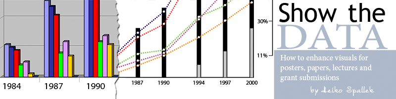
There are many ways to display complex ideas, however making your thoughts clear to observers can be a challenge.
Following Edward Tufte's thought, it becomes apparent that most of today's tools do an insufficient job in helping you to achieve this goal. We all have seen ill-designed graphs produced with the help of MS-Excel's built-in templates and mediocre MS-Powerpoint slides which are hard to read and even harder to understand.
Following basic design principles and using advanced graphic tools allows us to help you conveying your message clearly. Using our experience and knowledge in information design, visualization and typography, we can translate your ideas into compelling messages for your audience. Visualization of complex data can make complicated relationships clear and easy to understand. Display of quantitative data avoiding so called "chartjunk" can help you to persuade your audience. Customized MS-Powerpoint presentation templates can help you use your corporate identity when giving presentations to clients.
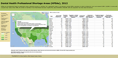
Check out the interactive version of graphic below, "Dental Health Professional Shortage Areas (HPSAs), 2012".
Effective visualization of complex relationships can be a challenge. Making sense of data in order to see patterns and trends that would otherwise be invisible to us is a formidable task. By transforming numbers into graphical shapes, viewers can understand the stories those numbers hide. Experience and knowledge in information design, usability and typography, allows me to translate your ideas into compelling messages for your audience. For instance, the example below is not the result of a one-time effort, but was created using an iterative design approach characterized by paper prototyping, user testing and expert review (final version shown at right, click here for enlarged graphic).
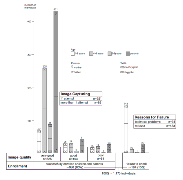
Showing a large amount of complex quantitative data is challenging task when space and format constraints apply. Avoiding so called "chartjunk" will make your message clearer and persuade your audience. Using MS-Excel templates can be a starting point, but should almost never be the end point of an effective design. Each of the following displays was created by having the individual story in mind that this data tells us. The commonality is to show with as little ink as possible as much data as possible.
Tips and Tricks can also be found at Heiko's blog.